Plotting with Matplotlib
Though there are many options for plotting data in Python, we will be using Matplotlib. In particular, we will be using the pyplot module in Matplotlib, which provides MATLAB-like plotting. The reason for this is simple: Matplotlib is the most common module used for plotting in Python and many examples of plotting you may find online will be using Matplotlib.
Our dataset
For our first lesson plotting data using Matplotlib we will again be using the weather data file from Lesson 5.
- The data file (
Kumpula-June-2016-w-metadata.txt) is in thedatasubdirectory. - It contains observed daily mean, minimum, and maximum temperatures from June 2016 recorded from the Kumpula weather observation station in Helsinki. It is derived from a data file of daily temperature measurments downloaded from the US National Oceanographic and Atmospheric Administration’s National Centers for Environmental Information climate database.
Getting started
Let’s start by importing the pyplot submodule of Matplotlib.
[1]:
import matplotlib.pyplot as plt
Note again that we are renaming the Matplotlib pyplot submodule when we import it. Perhaps now it is more clear why you might want to rename a module on import. Having to type matplotlib.pyplot every time you use one of its methods would be a pain.
Loading the data with NumPy
Those who have learned to use NumPy should load their data as follows.
To start, we will need to import NumPy.
[2]:
import numpy as np
Now we can read in the data file in the same way we have for Lesson 5.
[3]:
fp = 'data/Kumpula-June-2016-w-metadata.txt'
data = np.genfromtxt(fp, skip_header=9, delimiter=',')
As you may recall, we will now have a data file with 4 columns. Let’s rename each of those below.
[4]:
date = data[:, 0]
temp = data[:, 1]
temp_max = data[:, 2]
temp_min = data[:, 3]
Loading the data with Pandas
Those who have learned to use Pandas should load their data as follows.
To start, we will need to import Pandas.
[5]:
import pandas as pd
Now we can read in the data file in the same way we have for Lesson 5.
[6]:
dataFrame = pd.read_csv('data/Kumpula-June-2016-w-metadata.txt', skiprows=8)
OK, great. One thing we’ll do a bit differently this week is that we’re going to split the data from dataFrame into separate Pandas value arrays so we can plot things in the same way as with NumPy. We can split the data into separate series as follows:
[7]:
date = dataFrame['YEARMODA'].values
temp = dataFrame['TEMP'].values
temp_max = dataFrame['MAX'].values
temp_min = dataFrame['MIN'].values
The .values attribute of a Pandas series returns only the numerical values of the given series, not the index list.
Our first plot
OK, so let’s get to plotting! We can start by using the Matplotlib plt.plot() function.
[8]:
x = date
y = temp
plt.plot(x, y)
[8]:
[<matplotlib.lines.Line2D at 0x116357eb8>]
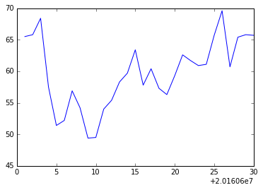
If all goes well, you should see the plot above.
OK, so what happened here? Well, first we assigned the values we would like to plot, the year and temperature, to the variables x and y. This isn’t necessary, per se, but does make it easier to see what is plotted. Next, it is perhaps pretty obvious that plt.plot() is a function in pyplot that produces a simple x-y plot. Conveniently, plots are automatically displayed in Jupyter notebooks, so there is no need for the additional plt.show() function you might see in examples
you can find online.
Basic plot formatting
We can make our plot look a bit nicer and provide more information by using a few additional pyplot options.
[9]:
plt.plot(x, y, 'ro--')
plt.title('Kumpula temperatures in June 2016')
plt.xlabel('Date')
plt.ylabel('Temperature [°F]')
[9]:
<matplotlib.text.Text at 0x1196ff320>
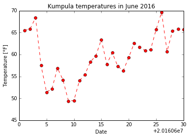
This should produce the plot above.
Now we see our temperature data as a red dashed line with circles showing the data points. This comes from the additional ro-- used with plt.plot(). In this case, r tells the plt.plot() function to use red color, o tells it to show circles at the points, and -- says to use a dashed line. You can use help(plt.plot) to find out more about formatting plots. Better yet, check out the documentation for ``plt.plot()`
online <https://matplotlib.org/api/_as_gen/matplotlib.pyplot.plot.html>`__. We have also added a title and axis labels, but their use is straightforward.
Embiggening* the plot
While the plot sizes we’re working with are OK, it would be nice to have them displayed a bit larger. Fortunately, there is an easy way to make the plots larger in Jupyter notebooks. To set the default plot size to be larger, simply run the Python cell below.
[10]:
plt.rcParams['figure.figsize'] = [12, 6]
The cell above sets the default plot size to be 12 inches wide by 6 inches tall. Feel free to change these values if you prefer.
To test whether this is working as expected, simply re-run one of the earlier cells that generated a plot.
* To `embiggen <https://en.oxforddictionaries.com/definition/embiggen>`__ means to enlarge. It’s a perfectly cromulent word.
Adding text labels to a plot
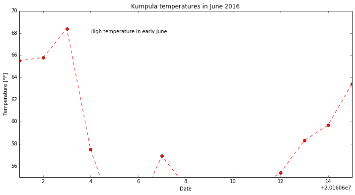
Adding text to plots can be done using plt.text().
plt.text(20160604.0, 68.0, 'High temperature in early June')
This will display the text “High temperature in early June” at the location x = 20160604.0 (i.e., June 4, 2016), y = 68.0 on the plot. We’ll see how to do this in a live example in just a second. With our approach to plotting thus far, the commands related to an individual plot should all be in the same Python cell.
Changing the axis ranges
Changing the plot axes can be done using the plt.axis() function.
plt.axis([20160601, 20160615, 55.0, 70.0])
The format for plt.axis() is [xmin, xmax, ymin, ymax] enclosed in square brackets (i.e., a Python list). Here, the x range would be changed to the equivalents of June 1, 2016 to June 15, 2016 and the y range would be 55.0-70.0. The complete set of commands to plot would thus be:
[11]:
plt.plot(x, y, 'ro--')
plt.title('Kumpula temperatures in June 2016')
plt.xlabel('Date')
plt.ylabel('Temperature [°F]')
plt.text(20160604.0, 68.0, 'High temperature in early June')
plt.axis([20160601, 20160615, 55.0, 70.0])
[11]:
[20160601, 20160615, 55.0, 70.0]
Bar plots in Matplotlib
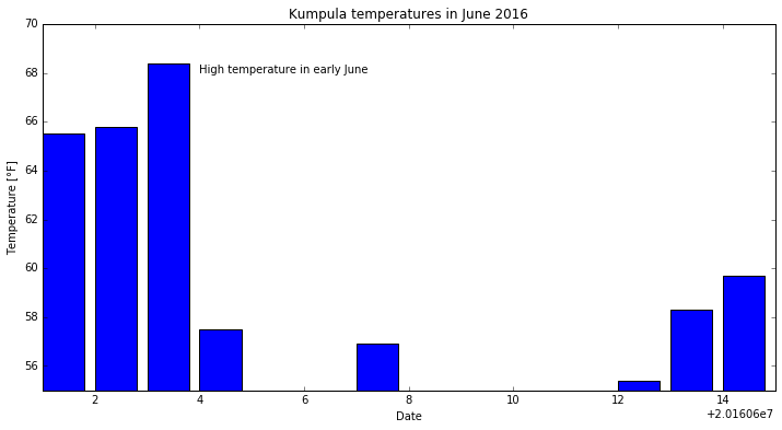
In addition to line plots, there are many other options for plotting in Matplotlib. Bar plots are one option, which can be used quite similarly to line plots.
[12]:
plt.bar(x, y)
plt.title('Kumpula temperatures in June 2016')
plt.xlabel('Date')
plt.ylabel('Temperature [°F]')
plt.text(20160604.0, 68.0, 'High temperature in early June')
plt.axis([20160601, 20160615, 55.0, 70.0])
[12]:
[20160601, 20160615, 55.0, 70.0]

You can find more about how to format bar charts on the Matplotlib documentation website.
Saving your plots as image files
Saving plots created using Matplotlib done several ways. The recommendation for use outside of Jupyter notebooks is to use the plt.savefig() function. When using plt.savefig(), you simply give a list of commands to generate a plot and list plt.savefig() with some parameters as the last command. The file name is required, and the image format will be determined based on the listed file extension.
Matplotlib plots can be saved in a number of useful file formats, including PNG, PDF, and EPS. PNG is a nice format for raster images, and EPS is probably easiest to use for vector graphics. Let’s check out an example and save our lovely bar plot.
[13]:
plt.bar(x, y)
plt.title('Kumpula temperatures in June 2016')
plt.xlabel('Date')
plt.ylabel('Temperature [°F]')
plt.text(20160604.0, 68.0, 'High temperature in early June')
plt.axis([20160601, 20160615, 55.0, 70.0])
plt.savefig('bar-plot.png')

If you refresh your Files tab on the left side of the JupyterLab window you should now see bar-plot.png listed. We could try to save another version in higher resolution with a minor change to our plot commands above.
[14]:
plt.bar(x, y)
plt.title('Kumpula temperatures in June 2016')
plt.xlabel('Date')
plt.ylabel('Temperature [°F]')
plt.text(20160604.0, 68.0, 'High temperature in early June')
plt.axis([20160601, 20160615, 55.0, 70.0])
plt.savefig('bar-plot-hi-res.pdf', dpi=600)
We’re only introducing a tiny amount of what can be done with pyplot. In most cases, when we would like to create some more complicated type of plot, we would search using Google or visit the Matplotlib plot gallery. The great thing about the Matplotlib plot gallery is that not only can you find example plots there, but you can also find the Python commands used to create the plots. This makes it easy to take a working example from the gallery and modify it for your use.
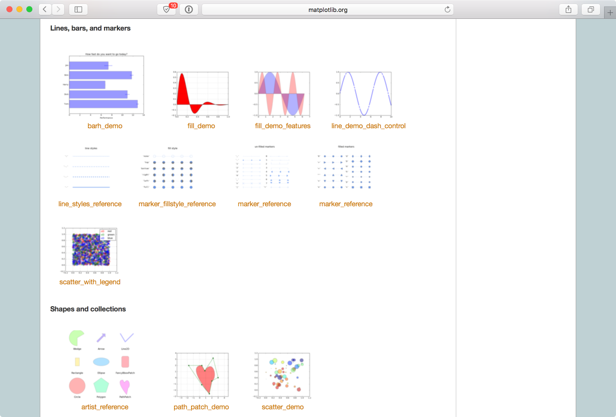
Your job in this task is to:
- Visit the Matplotlib plot gallery
- Find an interesting plot and click on it
- Copy the code you find listed beneath the plot on the page that loads
- Paste that into an Python cell in this notebook and run it to reproduce the plot
After you have reproduced the plot, you are welcome to try to make a small change to the plot commands and see what happens. For this, you can simply edit the Python cell contents and re-run.
For this task, you should use the values for arrays x and y calculated earlier in this part of the lesson, and use plt.axis() to limit the plot to the following x and y ranges: x = June 7-14, y = 45.0-65.0.
- What do you expect to see in this case?
Note: In order to get the plot to display properly, you will need to first type in the plt.plot() command, then plt.axis().